


PIXELS TO STITCHES
The Visual Guide to Your Brand’s Physical Identity.
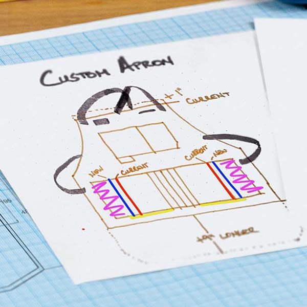
Why a Vector File for Embroidery is Your Brand’s Best Friend
We get it. You have a logo. It looks great on your website, but when you send it to us for custom uniform embroidery, we start talking about "Vectors" and "Digitizing."
If that sounds like a foreign language, don't worry. Most people think embroidery is just "printing with thread," but it’s actually a construction project. You need a blueprint (Vector), not just a photo (Pixel).
Here is the visual breakdown of how to move your brand from the screen to the stitch.
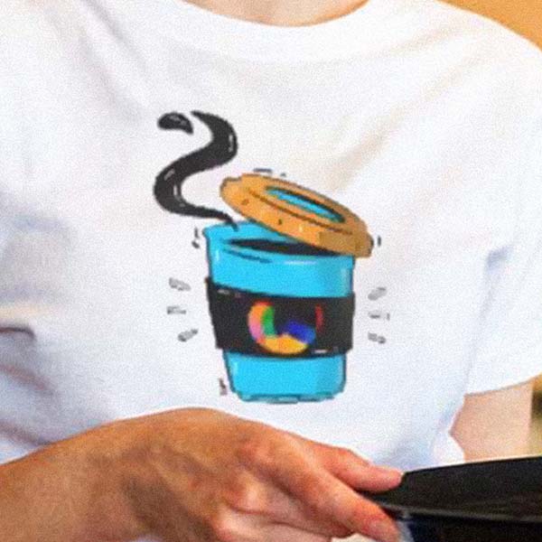
1. The Zoom Test: Pixels vs. Vectors
This is the most important lesson in branding.
-
Pixels (Raster): Made of tiny colored squares. When you zoom in, they get "fuzzy" or "blocky." This confuses the embroidery machine. (Files: .JPG, .PNG)
-
Vectors: Made of mathematical paths. No matter how much you zoom in, the line stays perfectly sharp. This tells the needle exactly where to go. (Files: .AI, .EPS, .PDF)

An illustration demonstrating why a vector file for embroidery is superior to pixels, ensuring a sharp and professional logo at any size.
Vectors are non-negotiable for professional scaling. For a deeper dive into the technical differences, check out Adobe's official guide on Raster vs. Vector.
2. The "Solid" Rule: No Gradients or Shadows
Digital art loves a sunset fade or a soft shadow. Thread does not. Because thread is a solid object, it cannot "fade" into another color like pixels on a screen.
To keep your custom embroidery logo design looking sharp, we simplify your art into bold, solid blocks of color.

Demonstrating embroidery design limitations regarding gradients and shadows, showing how simplifying artwork into solid colors results in a cleaner stitch.
3. The "Tiny" Rule: Thread vs. Fine Detail
A needle has a physical width. If your logo has text smaller than a grain of rice, the thread will overlap and create a "thread blob."

A visual guide explaining the physical limitations of an embroidery needle on fine details and tiny text in custom branding.
4. The Color Gap: Screen vs. Spool
Your computer screen creates color using light (RGB). But we use physical thread spools. Because thread is a 3D object, it reflects light differently than a flat pixel.
While we use systems like the Pantone Matching System (via Madeira) to get as close as possible, your "Hex Code" might look slightly different in the real world. This "soul" of the thread is what gives embroidery its premium, high-end feel.

Explaining thread color matching challenges and how physical threads reflect light differently than digital RGB screens.
The Big Idea: We want your team to look like authority figures, not a blurry mess. By providing a vector file for embroidery, you ensure your brand is represented with the prestige it deserves.
Ready to see your logo in 3D? [Click here to send us your vector file and start your custom quote today.]


Leave a comment (all fields required)